DIY Cover Art Design Mistakes – and Easy Ways to Fix Them
- Josh Wilhelm
- 4 hours ago
- 3 min read
Let’s be real: there are plenty of good reasons why artists, bands, and podcasters choose to DIY their cover art. Budgets are tight. You're trying to get your content out into the world quickly. And sometimes, it feels like slapping something together in Canva or Photoshop is “good enough.”

I get it.
But here’s the thing: your cover art is often your first impression. Whether it's on Spotify, Apple Podcasts, or Instagram, it’s the first thing people see—and it needs to stop them in their scroll. I’m not here to say you shouldn’t DIY your cover art, but here are some quick fixes to elevate your artwork. Let’s dive into three of the most common missteps I see (and how to fix them).
1. Poor Typography Choices
What Goes Wrong:
Fonts that are hard to read
Styles that clash with your genre or vibe
Harsh colors that don’t complement the rest of the design
One of the most obvious signs of a DIY cover is poor typography. Maybe it's an overly decorative font that looks more like a wedding invite than a metal album (I’ve seen it). Or maybe the text color gets lost in the background, making your title impossible to read at thumbnail size.
How to Fix It:
Study what's working. Look at cover art from others in your genre. What fonts are common? Are they bold, minimal, handwritten, sharp? Start recognizing patterns.
Match the mood. Ask yourself, “Does this font feel like my music/podcast?” If your song is raw and edgy, your typography should reflect that same energy.
Keep legibility in mind. If someone can’t read your title at a glance, they’ll scroll right past it.
Color Theory can be your best friend. Knowing how colors compliment and react with each other plays a huge role in readability.


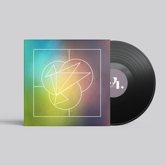
2. Overcrowding the Design
What Goes Wrong:
Trying to include everything (song title, artist name, logo, graphics, tagline... etc.)
No visual hierarchy—everything is fighting for attention
When you're designing your own cover, it’s easy to want to cram in every piece of information. But great design often comes down to what you leave out.
Think about Pink Floyd’s Dark Side of the Moon. No title. No artist name. Just one unforgettable graphic—and it’s become one of the most iconic album covers of all time.

How to Fix It:
Embrace white space. Don’t feel like you need to fill every inch of the design.
Ask, “What can I remove?” How many elements can you take away and still tell the same story?
Be strategic with what you include. If you have a long song name, consider leaving it off the cover entirely and let the visuals speak for themselves.
The goal is clarity and cohesion—not a visual to-do list.
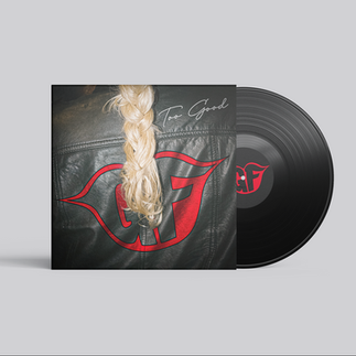
3. Stock or Generic Photography
What Goes Wrong:
Using cliché stock images that lack originality
Choosing photos that don’t match the vibe or story of the song/episode
There’s nothing wrong with using stock photography—if you know how to use it well. The problem is when it feels generic, overused, or disconnected from your message. A quick search on stock photo sites will turn up the same few dozen crowd or sunset photos used over and over again.
How to Fix It:
Hire a photographer. Custom imagery makes a world of difference. Even a simple photo shoot with your phone and good lighting can feel more personal than a stock image.
Edit and customize. If you do use stock photos, don’t just drop them in as-is. Crop them. Layer textures. Add color overlays. Make them your own.
Be intentional. Ask yourself, “Does this image actually reflect the story I’m telling?” If the answer is no, don’t use it.
The Ultimate Fix? Hire a Professional.


DIY design can be a great starting point—but at the end of the day, a professional designer (like me 👋) brings a trained eye and creative strategy to your project. I think deeply about things like composition, branding, audience appeal, and platform requirements—so you don’t have to.
If you’re ready to move beyond DIY and invest in cover art that tells your story, grabs attention, and represents your work with the quality it deserves, I’d love to help.
Let’s create something you’re proud to put your name on.